
BerryPay UI Customization lets partners seamlessly tailor the BerryPay widget to match their app’s brand, without touching the code. Directly from BerryDesk, partners can adjust colors, fonts, and visual styles so the widget feels native to their product, while keeping all payments secure, consistent, and fully maintained by ChainBerry.
How to customize BerryPay UI?
- Go to Settings → Technical
- Change the styles in the Customize BerryPay styles card
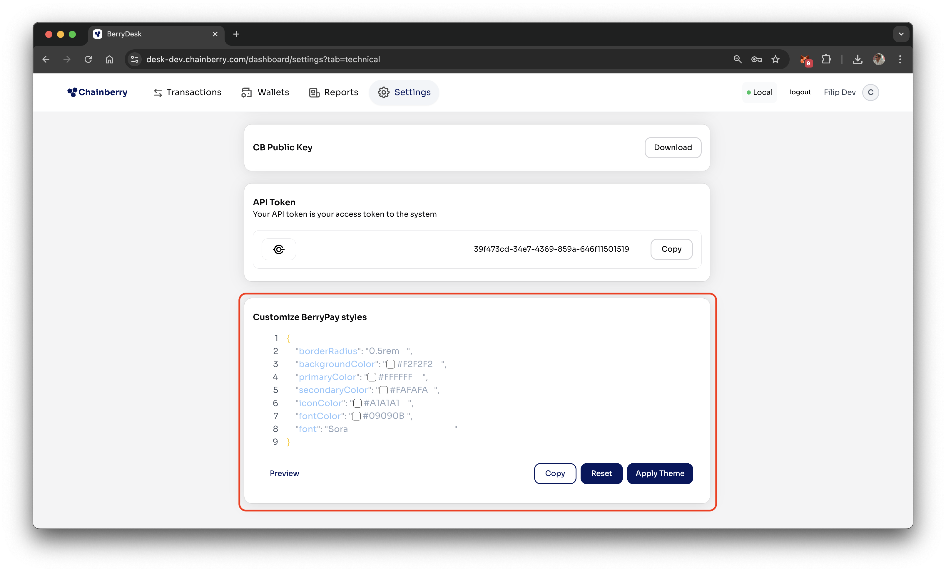
- Press Apply Theme
Other features
- Reset - Instantly revert all styles back to the ChainBerry default theme.
- Preview - See a live preview of how the customized BerryPay widget will look in your app.
Style properties
borderRadius | 12px | Corner radius for cards and UI elements. Supports px or rem. |
backgroundColor | #FFFFFF | Primary background color of the BerryPay widget. [1] |
primaryColor | #FFFFFF | Main surface color used for cards and containers. [2] |
secondaryColor | #FFFFFF | Secondary surface color for accents and highlights. [3] |
iconColor | #000000 | Color of action icons (info, QR code, copy). |
fontColor | #000000 | Color of all text content. |
font | Sora | Any font available from Google Fonts. |